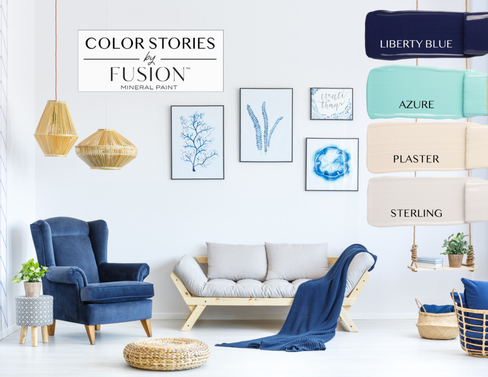
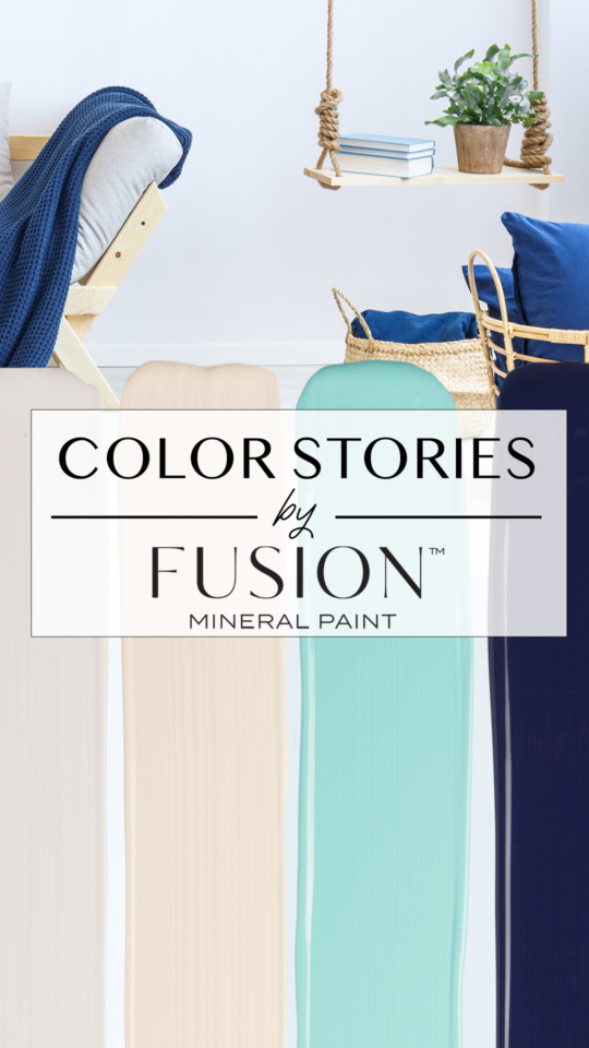
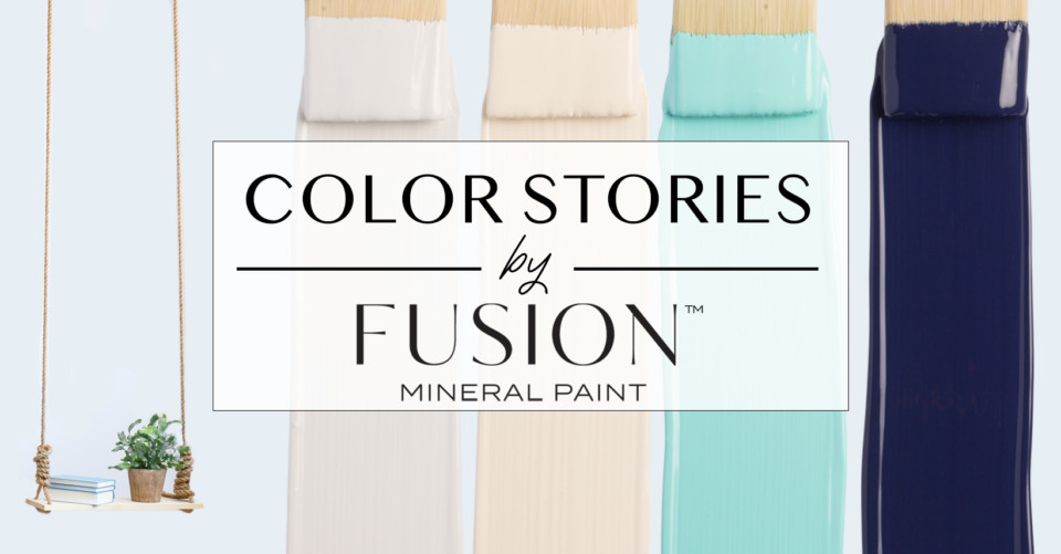
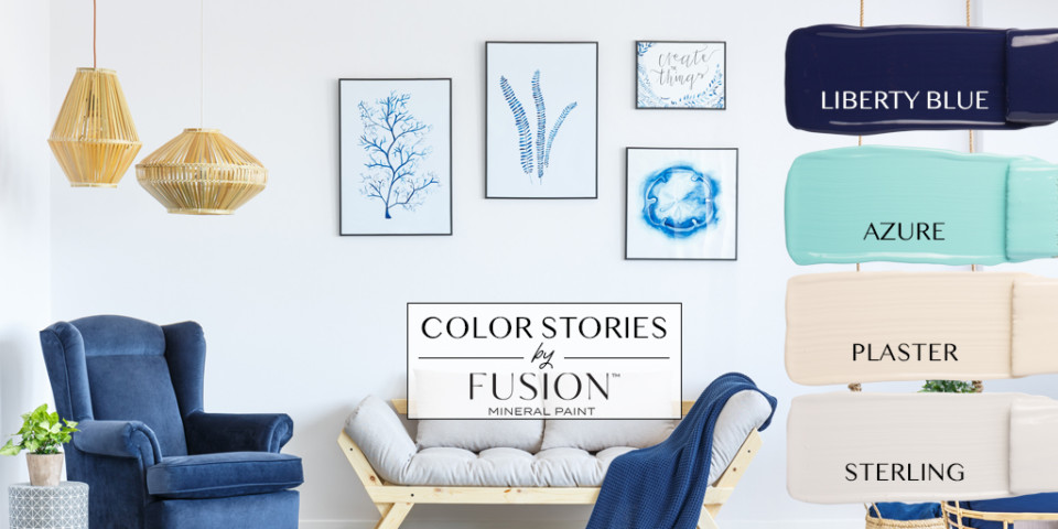
AUGUST’S COLOR STORY FROM FUSION MINERAL PAINT – ENDLESS SUMMER PAINT COLORS!LIBERTY BLUE, AZURE, PLASTER AND STERLING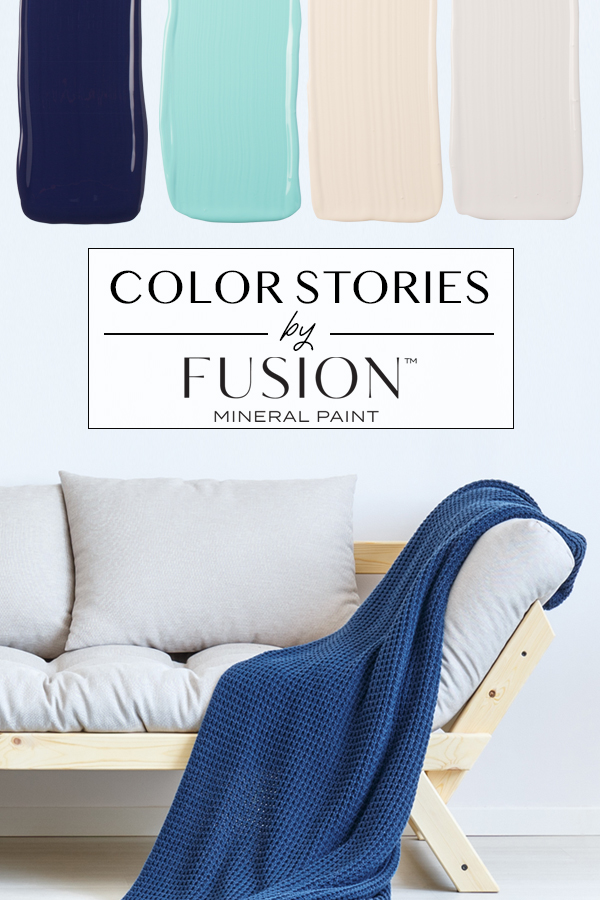
Summer is short. Too short actually. So when the slightest hint of warmer weather arrives in your pocket of the world, treasure that warm sunshine and lazy summer evenings like we all should! Fall will come soon enough, full of it’s rich tones, but we want to revel in the colors that remind us of oceans, lakes and beach front cottages where we spend long days with friends and family. While we know the end of summer is coming, we want to celebrate summertime and make it last and our August Color Story from Fusion Mineral Paint represents just that.
While contemporary in nature in the photograph, the color palette in August’s Color Story lends itself to a variety of coastal flavored rooms. Just looking at it, you can imagine a beach house with seashells and nautical themed decor or a modern cabin by a lake. Perhaps even a soothing vibe for a condo in the city where you want to bring in elements of natural elements like the seaside to an urban environment. Using texture to help draw the eye to it, the velvet chair, the knit blanket and of course the matching pillows reflects the perfect shade of rich blue, as seen in our Liberty Blue. Azure which is a hue that blends from blue skies into the clear waters of the ocean, is that perfect jewel of a color and appears throughout the art work on the walls. Plaster is seen in the touches of the furniture and baskets throughout the room and instantly makes you think of soft sand. And last but not least, Sterling, which is actually a cool neutral grey, but played against the colors such as Plaster can appear warmer. That’s the power of color matching. You can change your room just by adding an accent color and suddenly you have a whole new look. Let’s learn more about these fabulous four colors in our August Color StoryLIBERTY BLUE. This historical blue from our Canadiana Collection, Liberty Blue has stood the test of time for over 20 years. That’s when when we first came out with it. It definitely packs a punch and stands out so if you want to make a statement, this is what you’ll want to use. It has proven to be a staple in our paint collection. Pair it with Buttermilk Cream to create a rich, luxurious atmosphere. We even used it to paint a front door! AZURE. One of the most loved jewel tones around, Azure is a bright cyan blue and instantly makes you think of water and can often be found in vintage piece of jewelry. This color is bold, yet refined and a much loved member of the Penney & Co. collection. It is a vibrant rich tone which carries a sense of elegance and calm. We often see it used in kids rooms due it’s the joy it evokes. We love pairing Azure with whites to give it a stage to show off, but it is also really fun, vibrant and bold to mix it with some other blue and green tones. It is definitely a color that you remember.
PLASTER. A generously soft sand color – not too white, not quite beige. Plaster is a beautiful neutral for anywhere in your home. We feel this is one of the most underrated colors in our collection. Use it in a space with Renfrew Blue and it will add a sense of calm. For a fun and kind of unexpected pairing, use Plaster with Park Bench or Bayberry. This brings a natural, desert decor feeling. Bring in the uber-trendy rattan for some dimension and you’ve got a private oasis. STERLING. Our cool, neutral grey that is so versatile. It is a favorite neutral and a color that is aesthetically calming. As seen next to Plaster, it can appear warmer when paired with the right colors and as with most greys, lighting makes a key difference in your space. Use Sterling with Prairie Sunset for it’s fun, playful pops of yellow. Or keep it mature and dramatic by pairing some darker greys like Ash and Little Lamb.
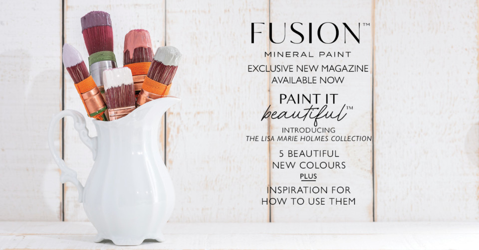
What your favorite’s from August’s Color Story from Fusion? How can you see using them in your home or throughout your space? If you do try out this palette, don’t forget to tag us in your projects or share it in our Paint it Beautiful Facebook group. CONNECT WITH FUSION MINERAL PAINTOur Paint it Beautiful Facebook group If you need something to tide you over in the meantime, pick up a copy of our Special Edition Magazine! It features 5 new projects in all of the new colors as well behind scenes magic of how the collection came to be.
|
August's Color Story by Fusion Mineral Paint