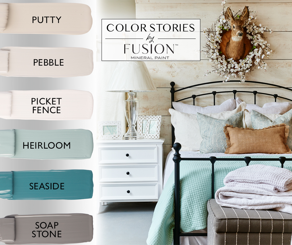
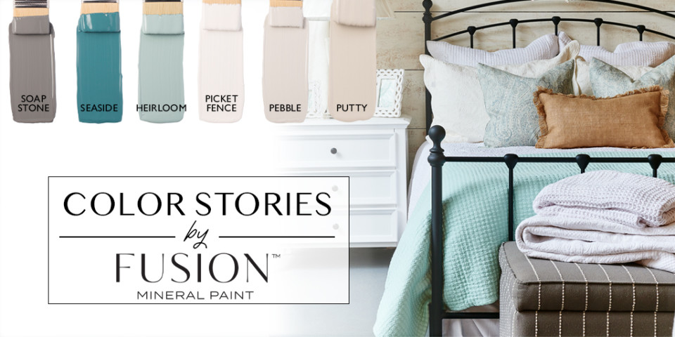
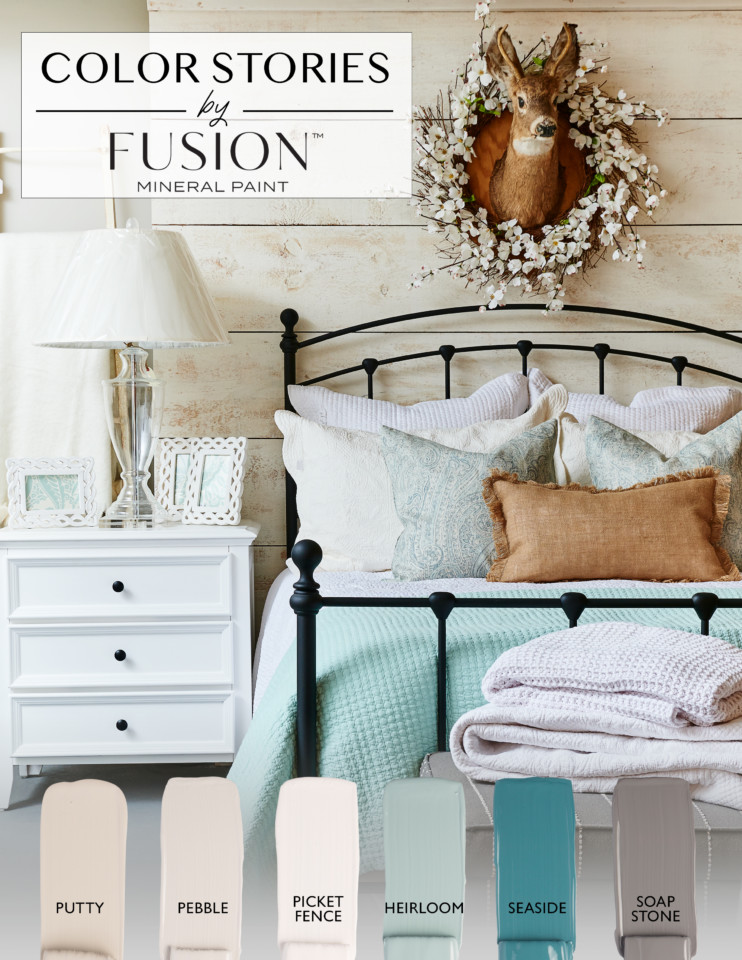
April's Color Story by Fusion Mineral PaintHeirloom, Pebble, Picket Fence, Putty, Seaside, and Soap Stone!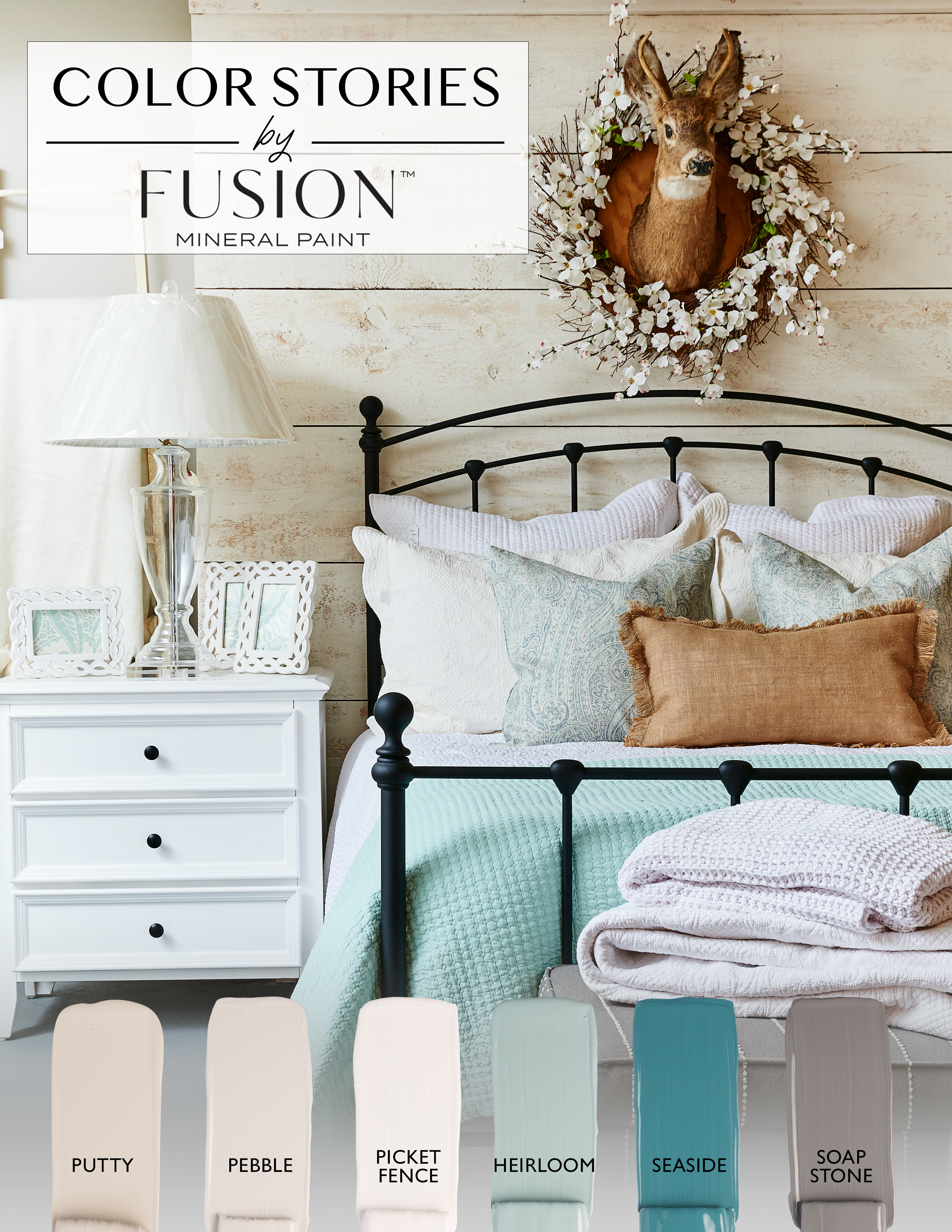
Are you ready for Fusion's April’s Color Story? We sure are! While we know April can bring some showers, rain often comes with a feeling of possibility after it passes and we wanted to take a moment to appreciate the beauty this time of year can bring. Spring is often a time of transformation. This is the month where we dust off the outdoor furniture, give everything a good clean and think about how to revive our surroundings. Maybe a new throw pillow or possibly a new wall color? Imagine fresh, crisp linens on your bed, windows open letting in that brisk air and finally getting to sit outside and enjoy a cup of tea on a porch, watching the dew over the grass glisten in the morning sunlight. April’s Color Story is all about that soothing vibe the evokes a breath of fresh air that this change of seasons brings and features colors from our best selling Penney & Co. collection! In our inspiration photo for April’s Color Story, you can find this comforting paint color collection reflected throughout the space. From Heirloom on the bed throw to hints of Seaside mixed in on the throw pillows, your eye then catches Soap Stone on the ottoman. Putty and Pebble can found on the whitewashed wood pallet walls with faux taxidermy to tie in that caramel color on the pillows that compliments all the blues featured throughout the space. Tying it all in but still letting the accent colors shine is the dresser turned side table is that light bright white reflected in Picket Fence. Everywhere you look, each color works with the next one and is picked up in the patterns and textures throughout the space, reminiscent of a Bed and Breakfast – except you can recreate this look for your own home! We know this makes us want to run and refresh our bedrooms ASAP!
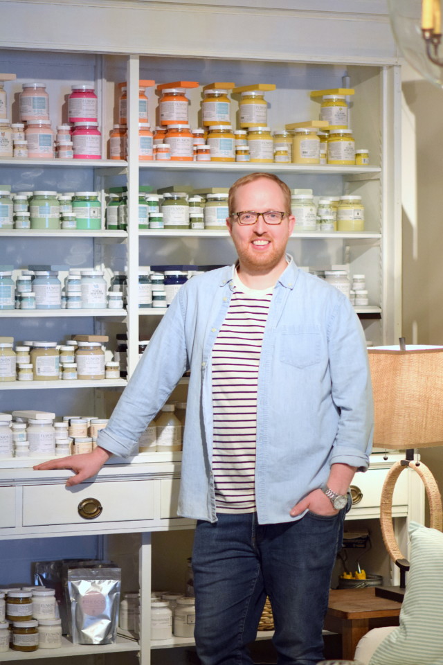
These are all the colors that are true to Michael Penney’s decor aesthetic. Michael Penney is a decorator, stylist and owner of the home store Penney & Co., located in historic downtown Whitby, Ontario. You can find Michael as a regular decor expert on the Marilyn Dennis show and when he’s not busy helping clients design their spaces, he will be out looking for timeless pieces to bring to his shop, painting furniture or sourcing new fabrics for his pillow collection. Be on the look out for his merchant profile on our blog later this month! Like Michael Penney’s shop, his Fusion paint color collection is complimentary to the colors you will find at his store and his decor aesthetic. A little bit beachy, a touch of farmhouse filled with versatile blues and greiges! Simple, classic, soothing colors that are perfect for changing out those heavy wool blankets into cotton and getting those fresh flowers into sea glass vases.
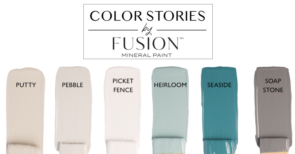
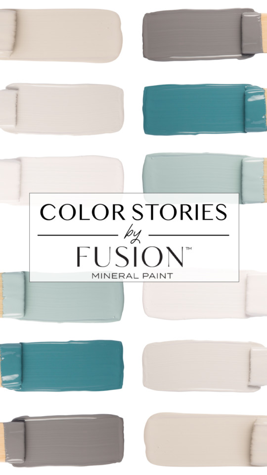
Let’s get to know our April Color Story colors better!
HEIRLOOM – Our cozy vintage blue, perfect for giving new life too hand me down pieces in need of some love. It traditional, attractive and perfect for refresh. Everyone who tries Heirloom falls in love with it! A little bit blue and a touch of green, Heirloom is cool, calm, and collected. PEBBLE – A warm yet eye catching grey, it is a great stand alone color but works will with other warm tones as well. Pebble is what we call a welcoming grey and pairs well with blues and greens for a lush and natural feel. You can also go modern by pairing it with Casement and our Brushed Steel Metallic. PICKET FENCE – This lovely bright white is a staple color for any room that needs a punch of light. Picket Fence is a true white – just like the white picket fence you’re thinking of. It doesn’t feel more like Spring that imagining that surrounded by yellow flowers and tulips! You can pair it with softer neutrals to make it stand out or use it as a backdrop for more bright color.
PUTTY – This sophisticated neutral blends beige and grey and grounds any color scheme. It is a truly the perfect greige. Classic, vintage, modern, you name it – it works with every decor aesthetic. Pair with it soft greens for a natural feel or with bright blues for some fun! SEASIDE – An exquisite deep coastal blue, don’t be afraid to try this out. Gorgeous on its own or pair with neutrals to create the perfect beachy atmosphere. It is perfect to use it as a jewel tone or as a natural blue and something that can often be used for accent pieces such a picture frame or a side table. SOAP STONE – Everyone’s favorite deep grey, Soap Stone is one of those colors that is totally dependent on its surroundings. A slight purple undertone encourages creativity and charm and this grey will change it’s hues, dependent on the light that reflects it. It is close to a slate grey but a bit warmer.
What colors from April’s Color Story from Fusion Mineral Paint do you love the most? Which do you think you will try and incorporate into your decor this month? Use the hashtag #PaintItBeautiful and #FusionMineralPaint to share your projects on Social Media!
|
Introducing April's Color Story